Gadgets
Consumer electronics, PDAs, cell phones, DVRs, DVDs, VCRs, camcorders, digital cameras, and anything else that uses a battery or electricity.
-
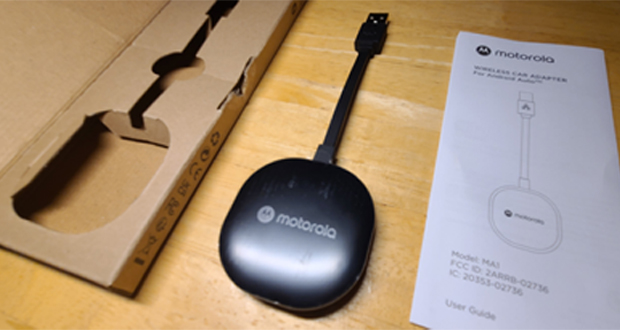
Motorola MA1 Wireless Android Auto Car Adapter Review
For years, I’ve been using a cable to connect my Samsung smartphone to my Android Auto in my car. It…
Read More » -

Alexa Controlled Sengled Smart LED Bulb Quick Review
There are tons of “smart” home products that you can buy these days. Personally, I have so many, sometimes I…
Read More » -

El Pollo Loco Delivers By Drone
I got a notification on my phone letting me know that El Pollo Loco will start delivering by drone. Apparently,…
Read More » -

Can’t Find HBO Max On Roku?
If you’re like me, you’ve been waiting all year for HBO Max to come onto Roku. Although I use my…
Read More » -
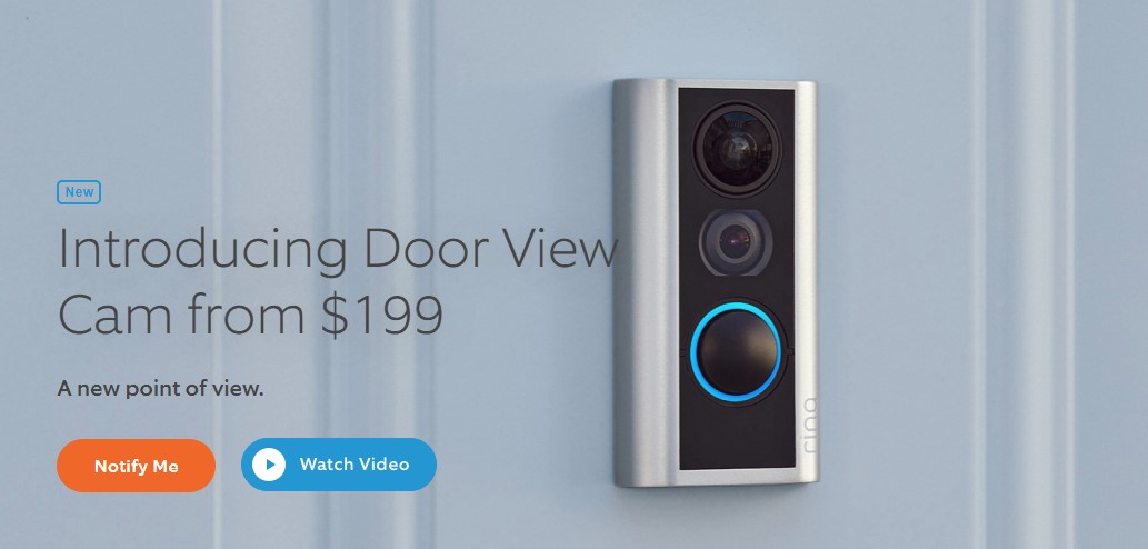
Ring Intros Door View Cam
Ring is best known for their doorbell camera, promoted on “Shark Tank,” and now owned by Amazon. Now they are…
Read More » -
Add Fun Skills to Your Amazon Alexa
Now that you’ve bought one of Amazon’s Alexa enabled devices, what else can you do with it? How about training…
Read More » -
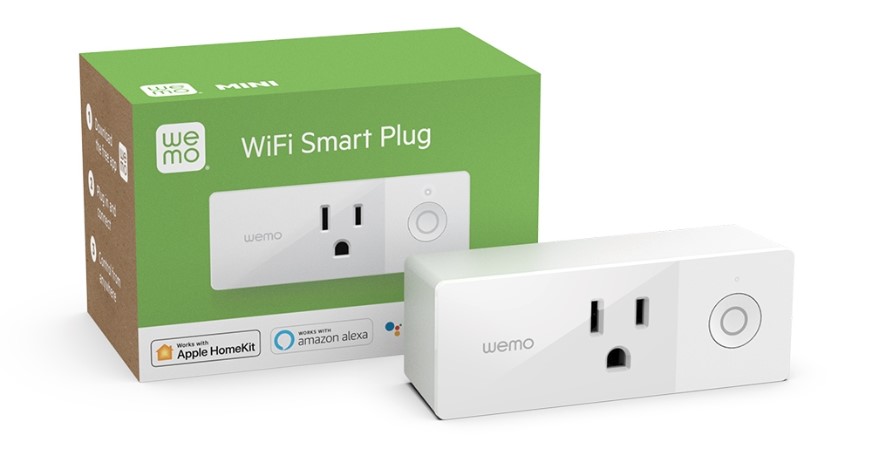
Wemo WiFi Smart Plug Quick Review
During the holidays, Amazon had a sale on Wemo Smart Plugs for $19.99 so I decided to buy a few…
Read More » -
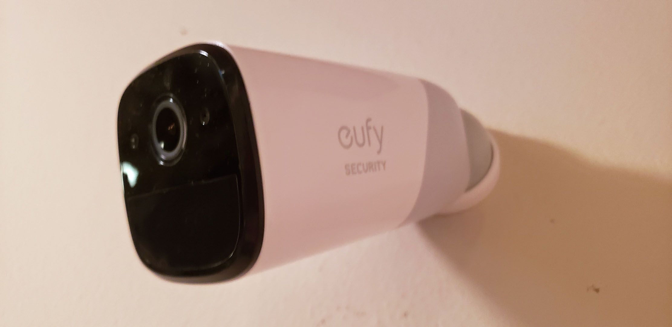
Wireless Security EufyCam With 1 Year Battery Life
My old Logitech Alert system has been discontinued for years and their new system costs $18 per month for 5…
Read More » -
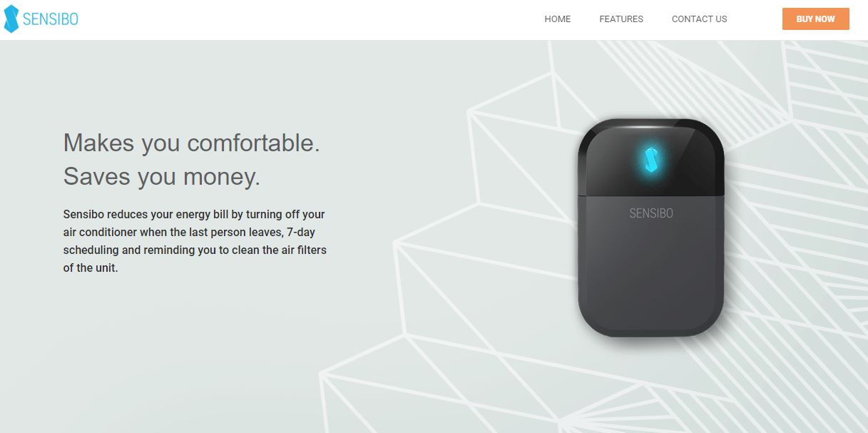
Sensibo Sky Smart AC Control Review
This is one of the hottest summers in recorded history for Los Angeles. For about 3 years, I used a…
Read More » -
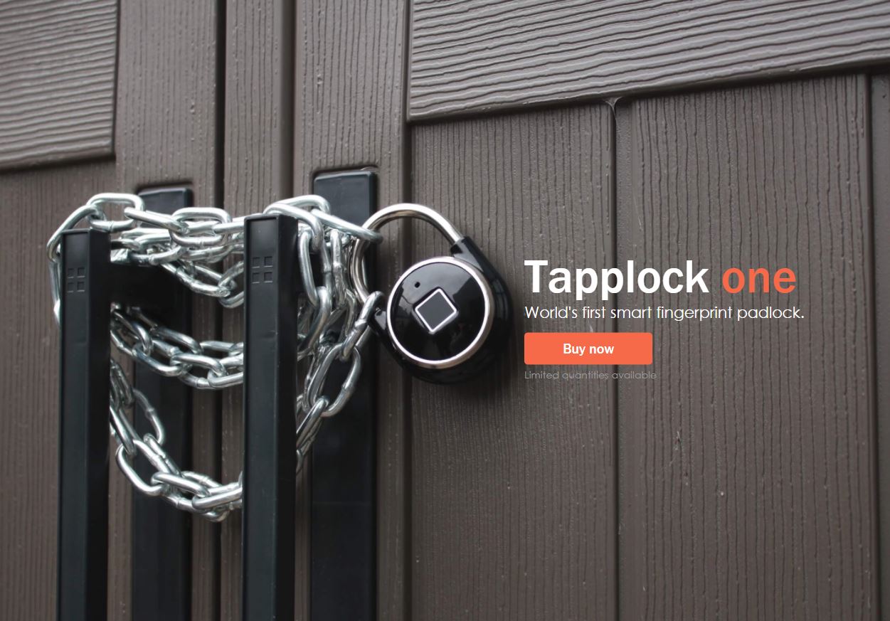
Tapplock Fingerprint Padlock Review
After using the Noke Bluetooth padlock for months, I wasn’t happy with how long it took to open my locker.…
Read More »